I Exist in Two Places
This is for those seeking somewhere they can just be, that feeling of sanctuary. The line is from a poem by Margaret Atwood: “I exist in two places, here and where you are.”
INSPIRATION
Seeking peace and fulfillment
Unrequited or destined relationships and love
Other worlds / Acceptance outside of society
MATERIALS
Opal Gemstone Tree
“Shrines in Snowy Mountains” by Utagawa Hiroshige
Oil Paint:
Vasari: Cadmium Yellow Light, Yellow Ochre, Raw Umber, Cadmium Red Light, Alizarin Crimson, Burnt Umber, Cobalt Bright Turquoise, Ultramarine Blue, Ivory Black, Phthalo Green
Mediums:
Panel: Artefex 532 Allinpanel Oil Primed Linen Panel (18”x24”)
Brushes:
Varnish: Conservar Regalrez 1094 Varnish Kit
PROCESS
Useful Premixes:
Ivory Black + Ultramarine Blue
Transparent Black (Phthalo Green+Alizarin Crimson+Ultramine Blue) + Burnt Umber
Yellow Ochre + Ultramarine Blue
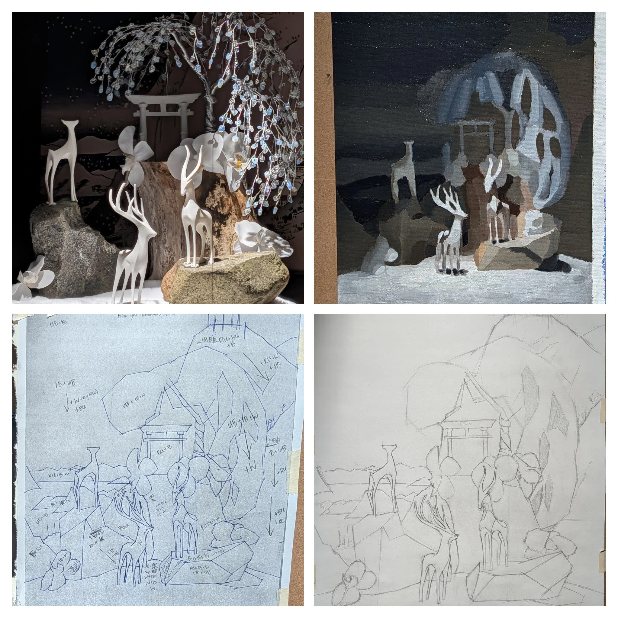
Clockwise from top left: Setup, Color Study, Cartoon, Color Study Notes
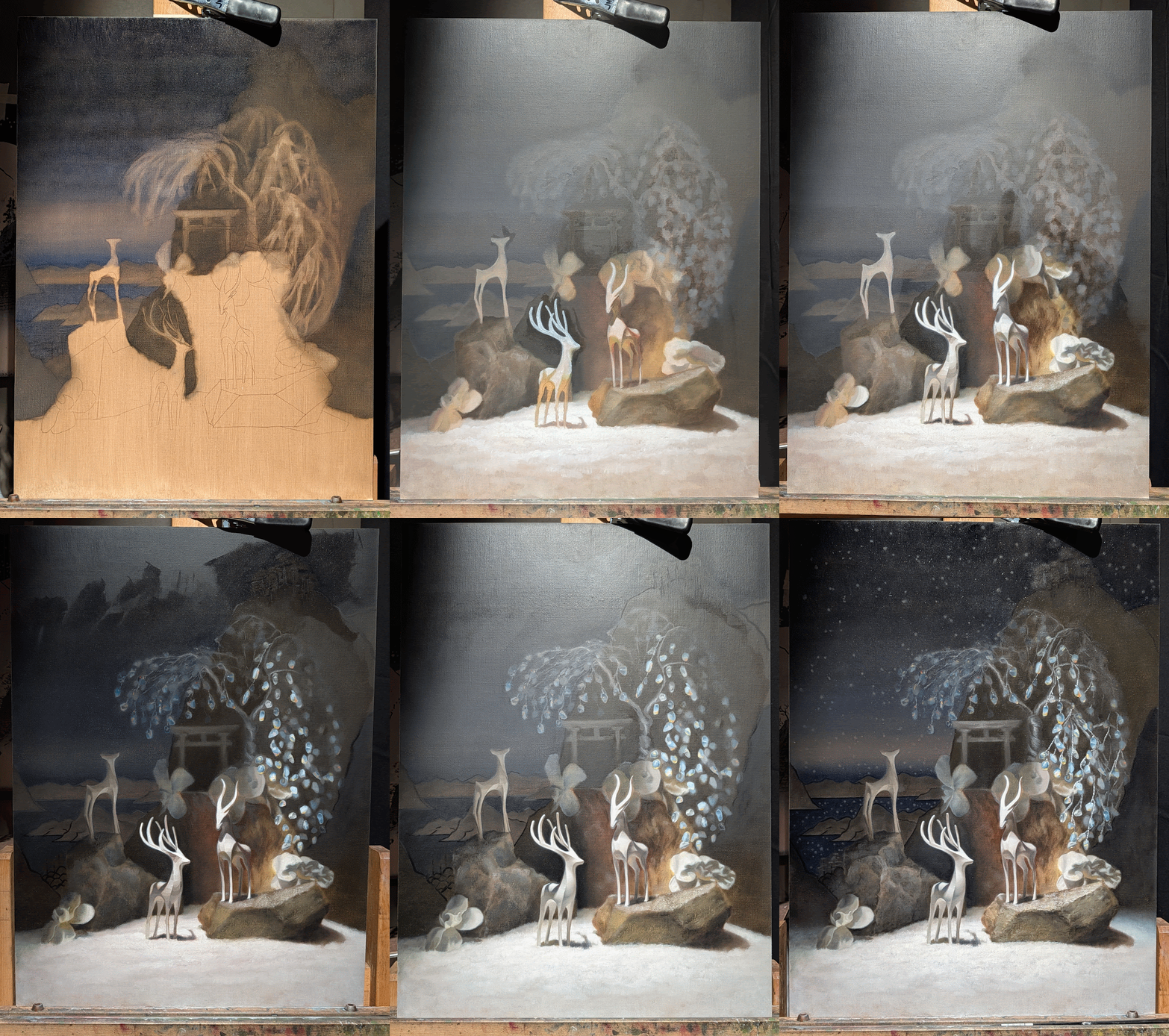
Process GIF
CONCLUSIONARY NOTES
General
Felt like this was a big breakthrough in understanding concept of fine art painting.
I apparently enjoy overshooting colorful, glowing shadows. Be mindful to not go overboard with this effect otherwise you’ll just have to go over it again and it takes longer.
It is possible to just not resolve certain areas for effect, which saves time. However, this needs to be planned for.
Tried out bristle brushes for transparent and brushy application again and did not care for them. From alla primas, I realized I liked bristles for heavy application in later layers, but much prefer to scumble in with soft filberts. When not scumbling, still vastly prefer soft rounds.
Developing Techniques
Impressionistic illusions vs. Direct realism
Impressionistic techniques were used to create the illusion of shiny gemstone leaves. After blocking in the general tree shape by wiping away from a freshly painted background, the fall of light was established with transparent paint, then specific shapes were re-established with opaque paint. Final layer contained chromatic and specular highlights within both lights and shadows, and a hierarchy of attention was created with varying edges and highlight intensity/color.
Opaque vs. Transparent effects
Opaque paint can be used in more unexpected places even when focusing on transparent paint application. Opaque paint can also give the illusion of a receding figure (see left deer) by compressing the value between the subject and its background. Scumbling over the opaque form-building layer with a similar value to the background also blurs it out to lose focus.
Sometimes it is useful to start with multiple layers of transparent paint and then re-establish the planes like done with the rocks.
Atmosphere and glow
Really enjoyed the atmospheric, almost vignette effect caused by the very lost edges where the white meets the background. This gives it a sense of depth and misty snow and helps draw focus towards the main subjects.
Achieved subtle glow on the white figures by keeping a close eye for fleeting impressions of color along the edges of the antlers and deer. These were usually colors found elsewhere in the set up (adds to illusion of objects being next to each other in an environment!). With a very thin brush (miniature paint brushes), place these colors next to the subject’s local color (in the deer’s case: pretty white) and then use a 4-6 size round brush to gently drag these layers together.
Process planning
Understanding how to manipulate paint and how previous layers will affect the ease of later layers is very important. Worked mainly back-to-front for the entire piece and then circled back from focal points to background. This allowed me to bring areas of interest into as much of a “focus-key” as possible, then ensure nothing competes with it.
Ended up basically finishing the background first. This is only possible with a carefully planned color study. Will want to get better at hitting some of those notes faster instead of taking two or three layers.
Certain effects and contrasts can only be achieved with conscious information editing. What you leave out and what is left un-stated is just as important as what is embellished.
Could use more work on planning around drying times of various pigments - especially ultramarine blue.
Can encroach into the foreground elements with a transparent background because it is easy to re-draw with opaque paint when you get to resolving the forward subjects. This will ensure you can control the edges.
Edge control
Hardest edge in the painting is straight white from the tube on the middle deer’s nose against a small strip of opaque ivory black background. The rest of the surrounding background is layers of transparent black mixes, feathering out to a lighter value.
Look deeply at edges along plane changes and outside of objects. Even a subtle up-plane on the edges of leaves or flowers can be explained!
Can do hard edges without pulling focus if the neighboring values are similar. However, can support these hard edges and make them interesting by using transparent layers underneath the harder edged plane.
Chromatic aberrations and keyed contrasts
With a relatively neutral overall color scheme, it was possible to use the most chromatic accents of paint straight out of the tube within the gemstone leaves to get them to read “sparkly”. Will want to keep this in mind for planning future projects and keeping most of the paintings overall neutral with pops of chroma.
Outlining with liner brushes and cartoon value contrasts
Used a liner brush for the first time and enjoyed the way it felt like calligraphy. However will need to be more aware of the value and saturation of any future outlines. Going too dark at first unwittingly created too much contrast and flattened the image because the background stopped receding. This was fixed by scumbling a lighter value from the mountains and water on top of the dark outlines, which darkened the background objects but compressed the value contrast.
Various paint handling techniques
Wiping out from wet paint for blocking in drawing using a make up sponge.
Scraping out with a palette knife after paint is applied to an area is fun. This can create ethereal transparency, but with textured, like with the rocks.
Scumbling and glazing
Constant push and pull of transparent paint to organically arrive at what you personally like. Mixes optically.
Can always get back to what you want with opaque paint placed on top of the scumbling and glazing.
Wet-into-wet blending for textural effects
Suggestion of a fuzzy, fur-like foreground against the deer and rock cast shadows was created by creating opaque statements of the foreground next to opaque statements of the correct color/value of cast shadow and then using a dry make up brush to flick them together in a specific direction.
