A Fervent Return
I have pursued survival for far too long. It is time to come home and tend to the persistent passions I now choose to nurture. My homecoming brings experiences and resources that will shape the next chapter, and I am forever grateful to be returning safely.
INSPIRATION
Returning home after work
Nurturing old and enduring interests/passions
Indulging in dedication to new pursuits
MATERIALS
Oil Paint:
Vasari: Cadmium Yellow Light, Yellow Ochre, Raw Umber, Cadmium Red Light, Alizarin Crimson, Burnt Umber, Cobalt Bright Turquoise, Ultramarine Blue, Ivory Black, Phthalo Green
Winsor & Newton Griffin Alkyd: Alizarin Crimson, Ultramarine Blue
Mediums:
Panel: Artefex 532 Allinpanel Oil Primed Linen Panel (18”x18”)
Brushes: Utrecht Manglon Synthetics
Varnish: Conservar Regalrez 1094 Varnish Kit
PROCESS
Useful Premixes:
Cadmium Red Light + Alizarin Crimson
Cobalt Bright Turquoise + Cadmium Yellow Light
Alizarin Crimson + Ultramarine Blue + Phthalo Green
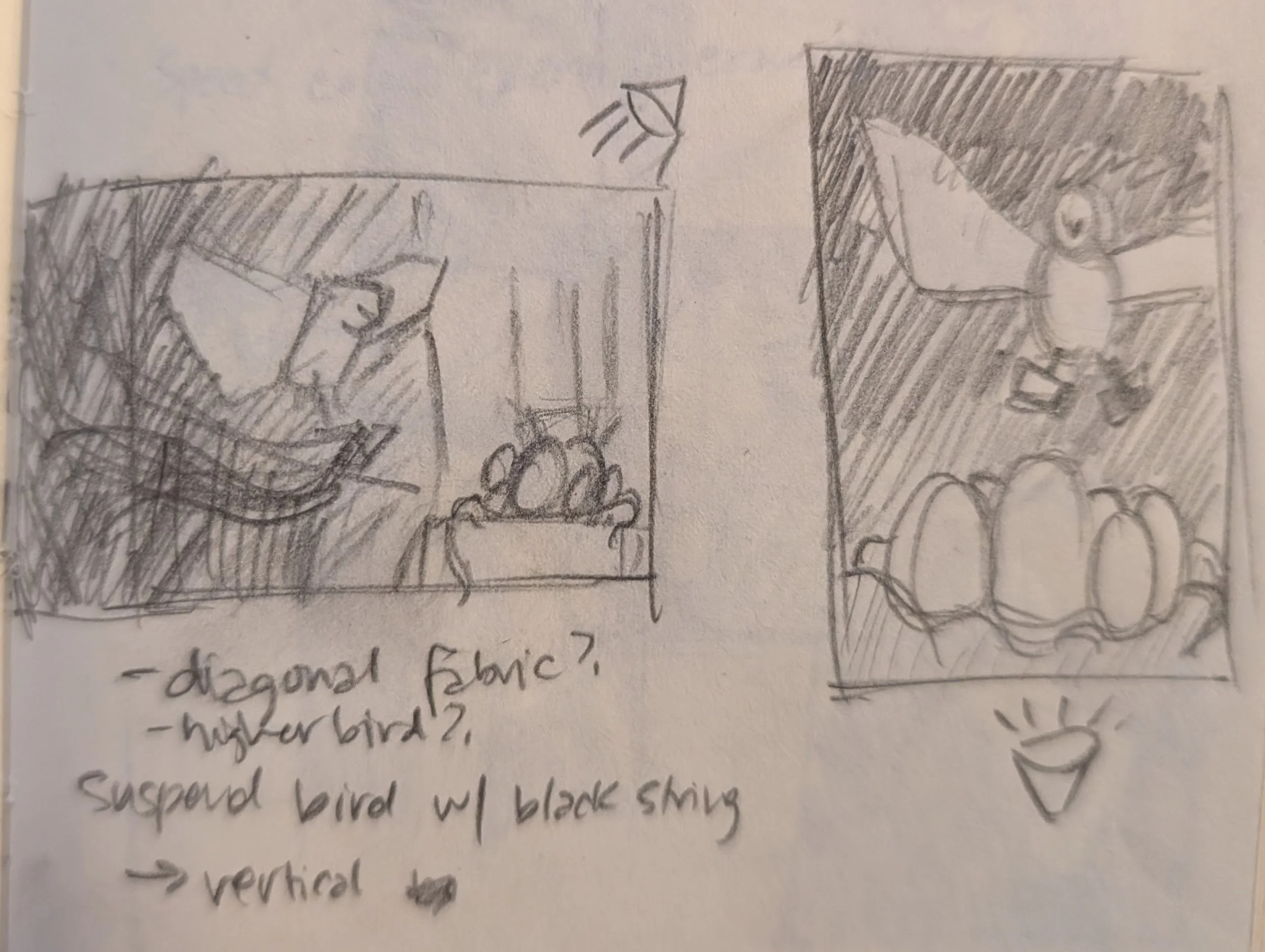
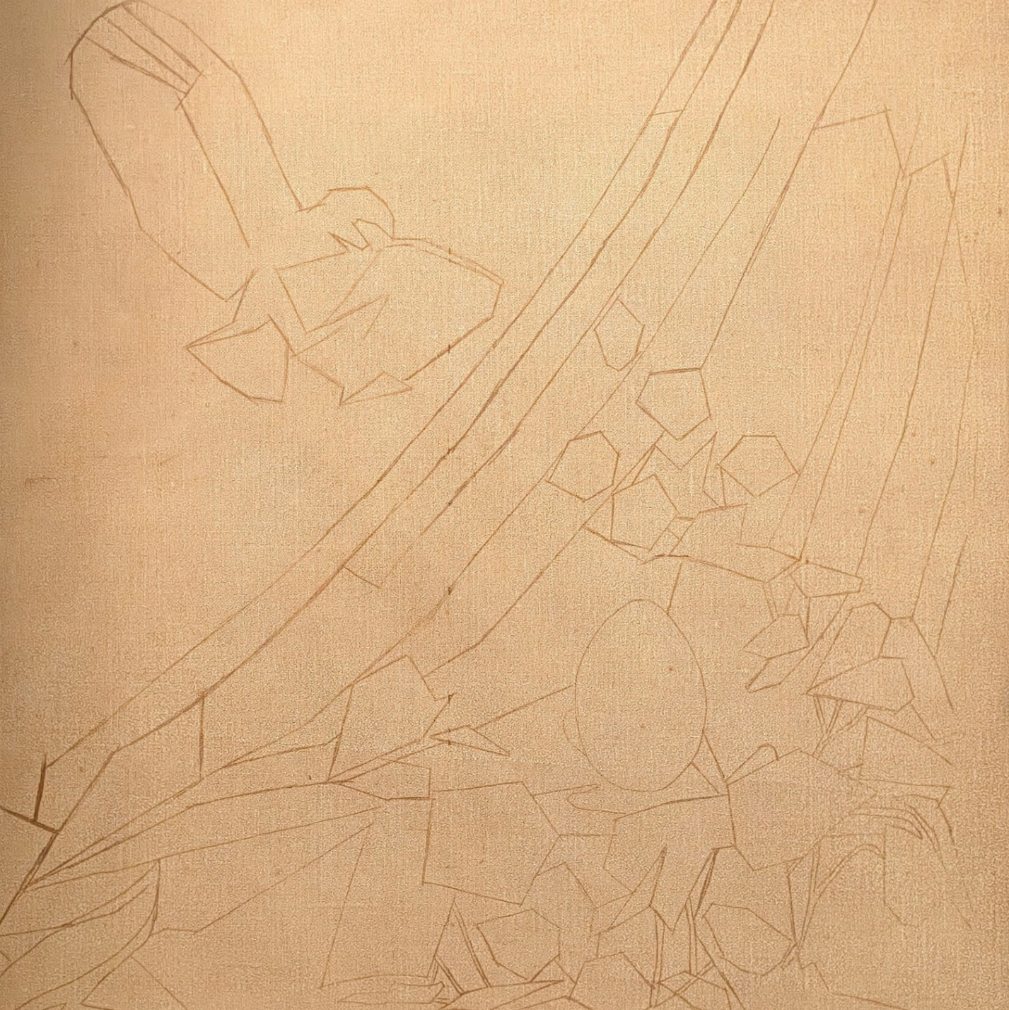
Conceptual notans playing around with composition and design. Initially there were going to be a lot more eggs of different materials… I am glad they were edited out. This kept it simple but still striking.
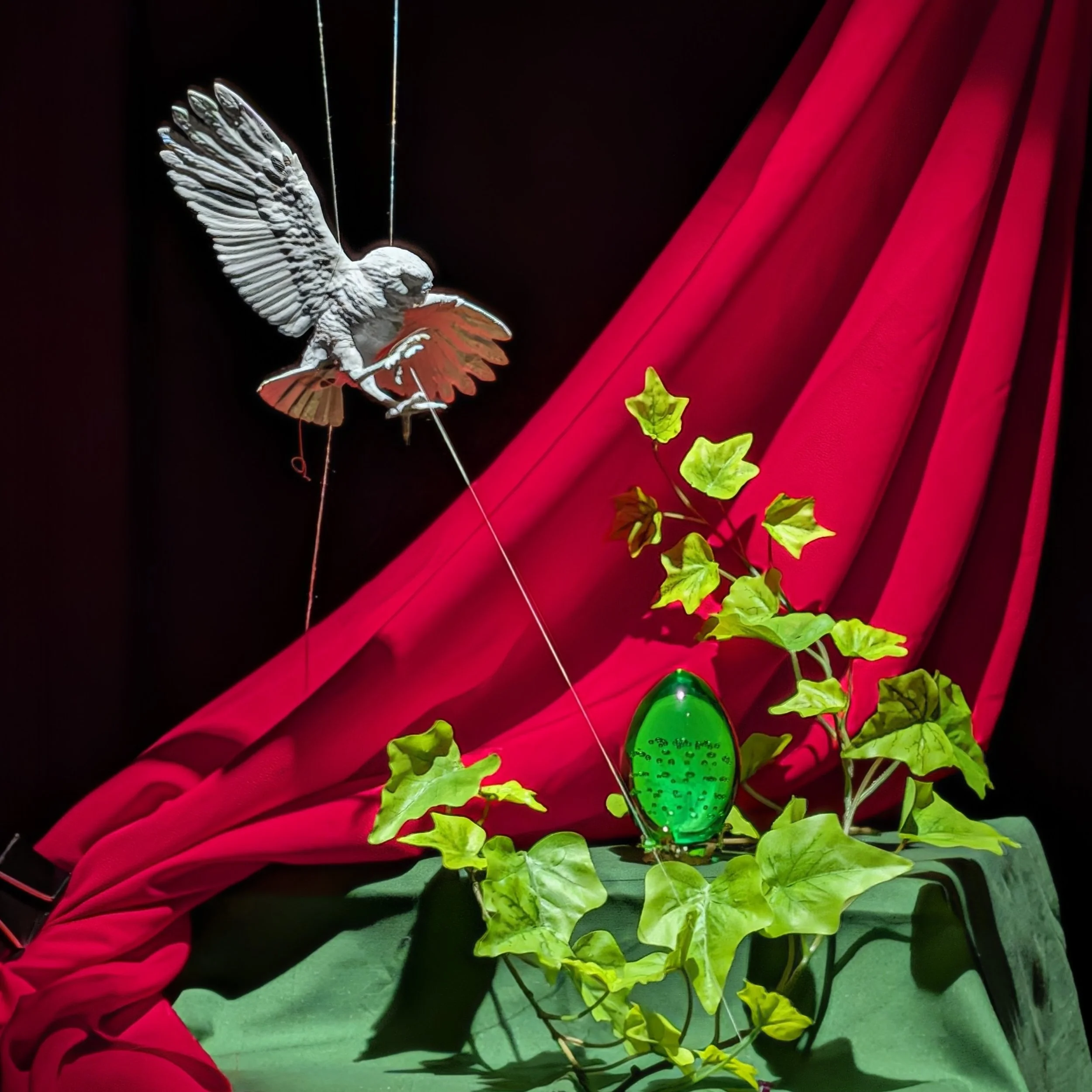
Still life setup. The only thing that stayed constant throughout the painting process was the egg due to gravity and various movements and air circulation. Also I accidentally blew on everything once trying to get some dust off…
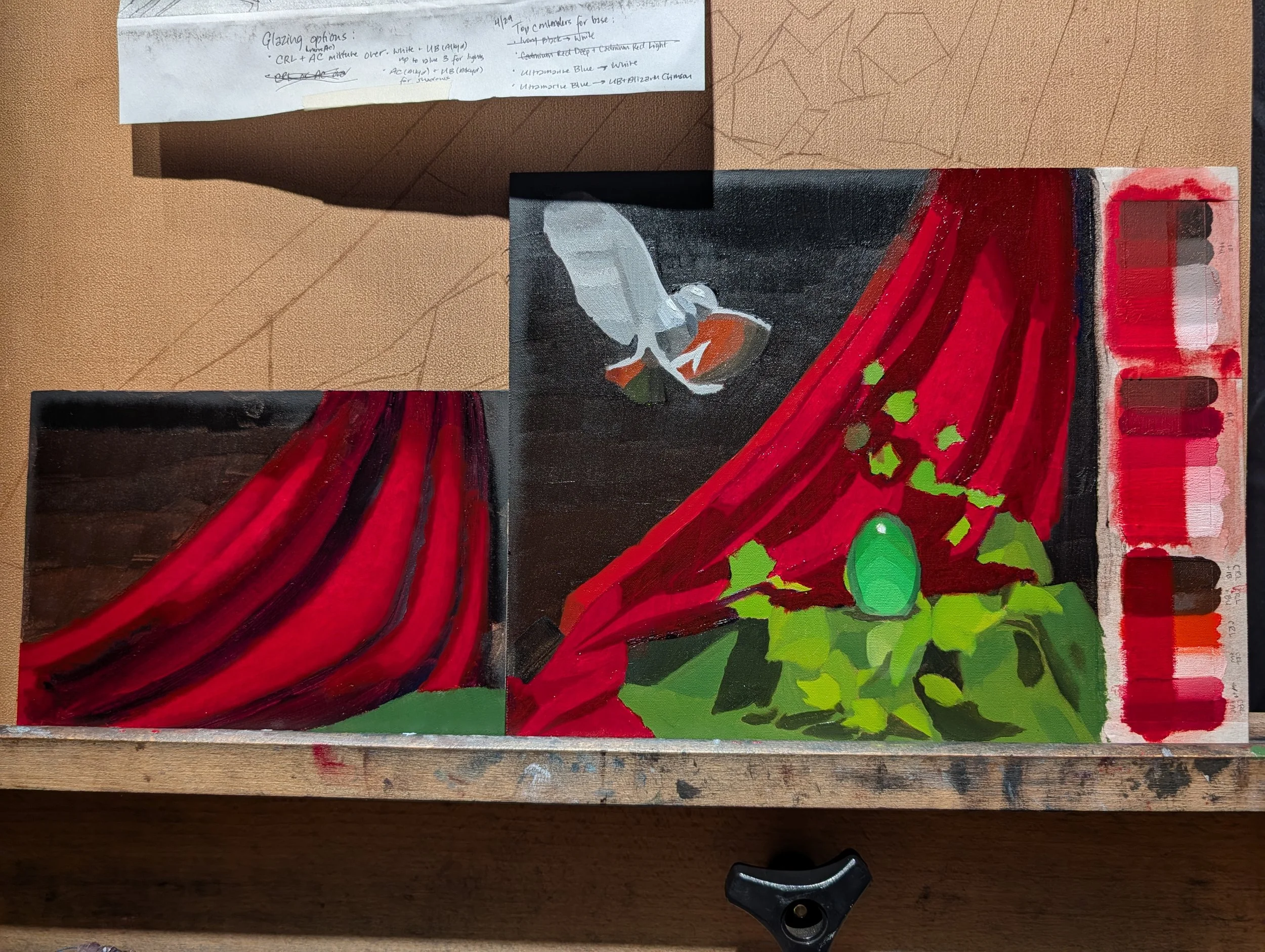
Color and Value Studies. Had to include phthalo green as a special guest to punch up the glass egg. Ended up with ultramarine blue + alizarin crimson to underpaint the fabric shadows and cadmium red light + white to underpaint the fabric lights to emphasize the warm/cool relationship of the final product. It was hard for me to believe part of the shadowed wing ended up being just straight cadmium red light.
Process GIF
CONCLUSIONARY NOTES
General
Personal tendency to over-render areas. Combat by adding additional layer of scumble or glaze on top to re-generalize and create attention-grabbing rhythms with a variety of rendering.
Walnut alkyd and alkyd-based paints are useful for speeding up drying times between layers.
Incorporating more neutral colors will help make higher chroma areas pop instead of oversaturating the painting. Pick either neutralizing in the broader lights or in the half-tones.
Challenge of still life/scene painting is to show that things are next to each other. Adjacent and environmental objects will bounce light/color onto each other. This will lend credibility that everything is integrated.
Soften edges as you go with a dry brush or make up brush. Easier to make edges sharp as a special effect rather than softening edges, which will require re-mixing the bordering colors again.
Transparent Paint
Transparent oil paint application is used to generate specific effects; use mindfully. Glazing and scumbling provide a more complex color experience, as layers blend optically rather than as a direct opaque layer. Transparent application can drastically enhance chroma. This all requires experimentation since each pigment will behave differently based on chemical composition.
Glazing will tend to re-generalize areas, so you can work into the glaze layer while wet with different colors and values to re-establish or push/pull the light effect.
The more underlying structure described underneath a glaze, the easier the glazing process will be. However, subsequent adjustment of the glazing layer is still possible after drying, using either an opaque or transparent paint layer on top. Do not assume a glazing layer is a “one-and-done” as adjustments and cleaning are usually required.
Alizarin Crimson + Ultramarine Blue + Phthalo Green is a very interesting transparent black that creates a more lively effect than using Ivory Black for dark areas/darken other colors. I will want to use this more often.
First lay down stand oil + linseed oil mixture then work glaze pigment into the wet medium layer. Use the thinnest, softest fan brush possible to spread glaze smoothly onto large simple, unstructured areas. For more structured areas, manipulating the glaze with a make up brush or mop is sufficient since the structure will detract from any streakiness in the glaze layer.
Additional layers of paint on top of a glazed layer will tend to drop vibrancy effect.
Specular Highlights
Specular highlights should sit on top of a lower value area to achieve illusion of full brightness. Chromatic aberrations are due to a prism-like effect that scatters light visibly distinct, high chroma in the area around the specular highlight. This can be mimicked using complementary colors or a rainbow spectrum around the highlight.
Specular highlights are placed secondarily to form. They are a special effect to be placed on top of an already-realized object. They change relative to the viewer and is caused from light being reflected directly back into the viewer’s eyes. Be wary of making the object itself too bright if you do not wish to lose the illusion of a bright highlight.
Specular highlights can have a hierarchy to them throughout the painting. Some can be tinted to reinforce the color of the object they are sitting on. Some highlights are not as bright as others based on how far from the light source they are.