You Are Not ___ Enough
You have been challenged. Whether from yourself, from your family, from a stranger, or simply from your circumstances, what do you do when you face these words? … Bear in mind there are no correct choices, however you will have to live with the consequences.
INSPIRATION
Negative self-talk
Overcoming obstacles and adversity to progress
What doesn’t kill you gives you EXP
MATERIALS
Cast Paint
Oil Paint:
Vasari: Yellow Ochre, Raw Umber, Cadmium Red Light, Alizarin Crimson, Burnt Umber, Cobalt Bright Turquoise, Ultramarine Blue, Ivory Black
Panel: Artefex 538 Allinpanel Oil Primed Linen Panel (18”x24”)
Brushes: Utrecht Manglon Synthetics
Varnish: Conservar Regalrez 1094 Varnish Kit
PROCESS
Useful Premixes:
Yellow Ochre + Ultramarine Blue
Yellow Ochre + Alizarin Crimson
Alizarin Crimson + Burnt Umber
Cobalt Bright Turquoise + White
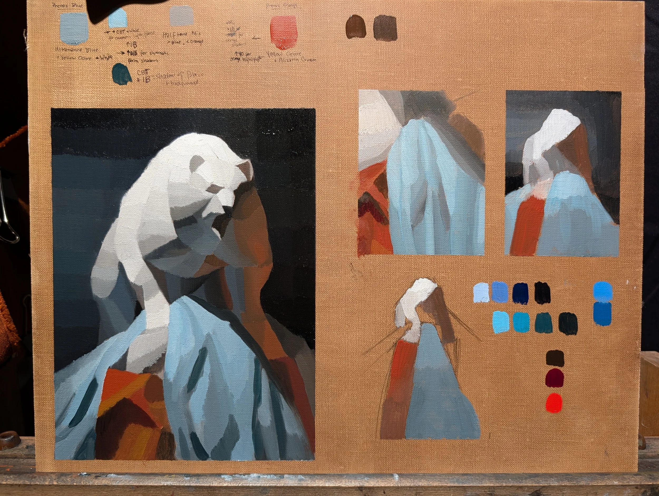
Color and Value Studies. Required Cobalt Bright Turquoise palette addition to achieve desired effect of high chroma light blue for parts of fabric
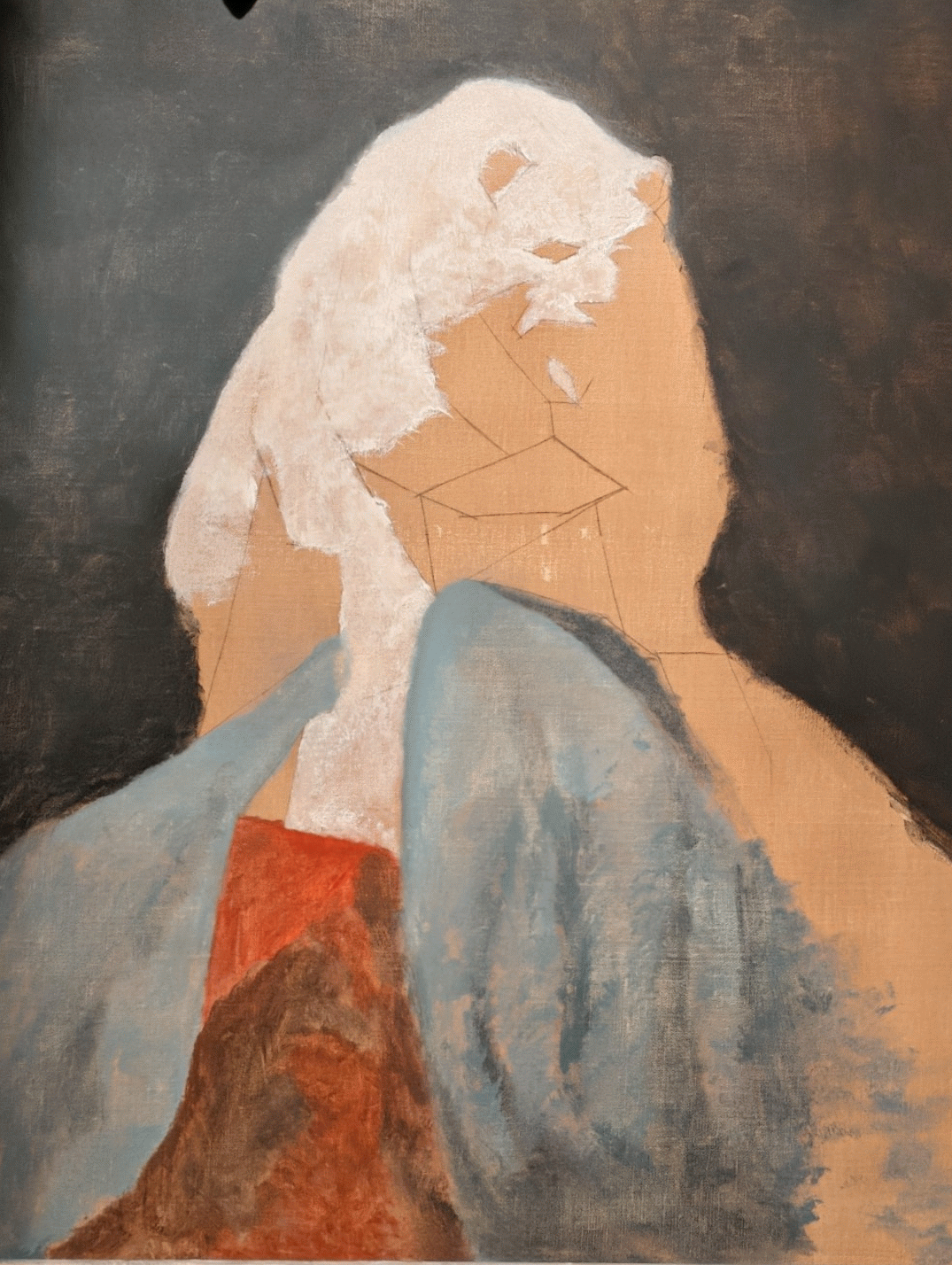
Painting Process
CONCLUSIONARY NOTES
General
It is not required for every part of the painting to get the same level of articulation and layers to achieve a desired effect. In this example, all the colorful shadowed areas were accidentally completed with just two attempts at first painting. In highly compressed areas, it is acceptable to just work directly into transitions without formally utilizing second painting techniques.
“Flourishing” with the paint brush can be appropriate in certain places to keep a brush profile. This will also force you to load the brush with sufficient paint and press hard enough mechanically to make a fun statement, like personal calligraphy.
Fabric has a ton of planes and different methods of finishing will be used for different sections of fabric depending on complexity. Do not underestimate fabric, it is like a whole additional painting!
Color
Controlling temperatures within the lights and neutrals is important to keep your cast looking like a white cast instead of looking dirty.
Do not be afraid of chroma!
Moving from the orange side to the blue side we notice a lot of purple. Do not attempt to make this purple by combining orange and blue pigments together, this will drop your chroma. Instead, make that purple raw from your starting pigments and then season the transitions respectfully.
Turquoise Blue Light + Ivory Black makes a very satisfying dark electric blue and a light blue highly chromatic palette addition was required to maintain chroma in the lighter sections of fabric. Ultramarine Blue + Lead White yielded an unsatisfying low chroma light value blue.
Instead of darkening Alizarin Crimson with Ivory Black to make a dark red, add Burnt Umber in order to keep the color in the RED family without drifting into purple/blue. This logic will apply to anytime you want to change value but want to keep hue consistent.
The best way to keep high chroma is to mix related hue paints directly from your starting palette.
Process
“Cushion” / “Working Into the Soup” —> Make large swatch of paint statement down and adjust within that color statement as necessary. Allows you to first simplify large areas and then create statements within that area by adjusting on the canvas.
Be more specific with dead coloring in the future.
Soft edges are easily created by dragging a dry, preferably splaying brush across the border of two wet planes. More brushing = softer edge. You can drag from one statement into the other to give character to the soft border.
Be patient and do not push timelines harder than drying time will allow. Oiling-in prematurely will cause the preceding layer to come off and it will be immensely frustrating to work over it without the underlying structure.